Venice Does Not Need to Be Invented
Venice already possesses its own visual language. Its beauty lies in the evidence of time: weathered façades, shifting reflections, rooms shaped by craftsmanship and light passing through water.
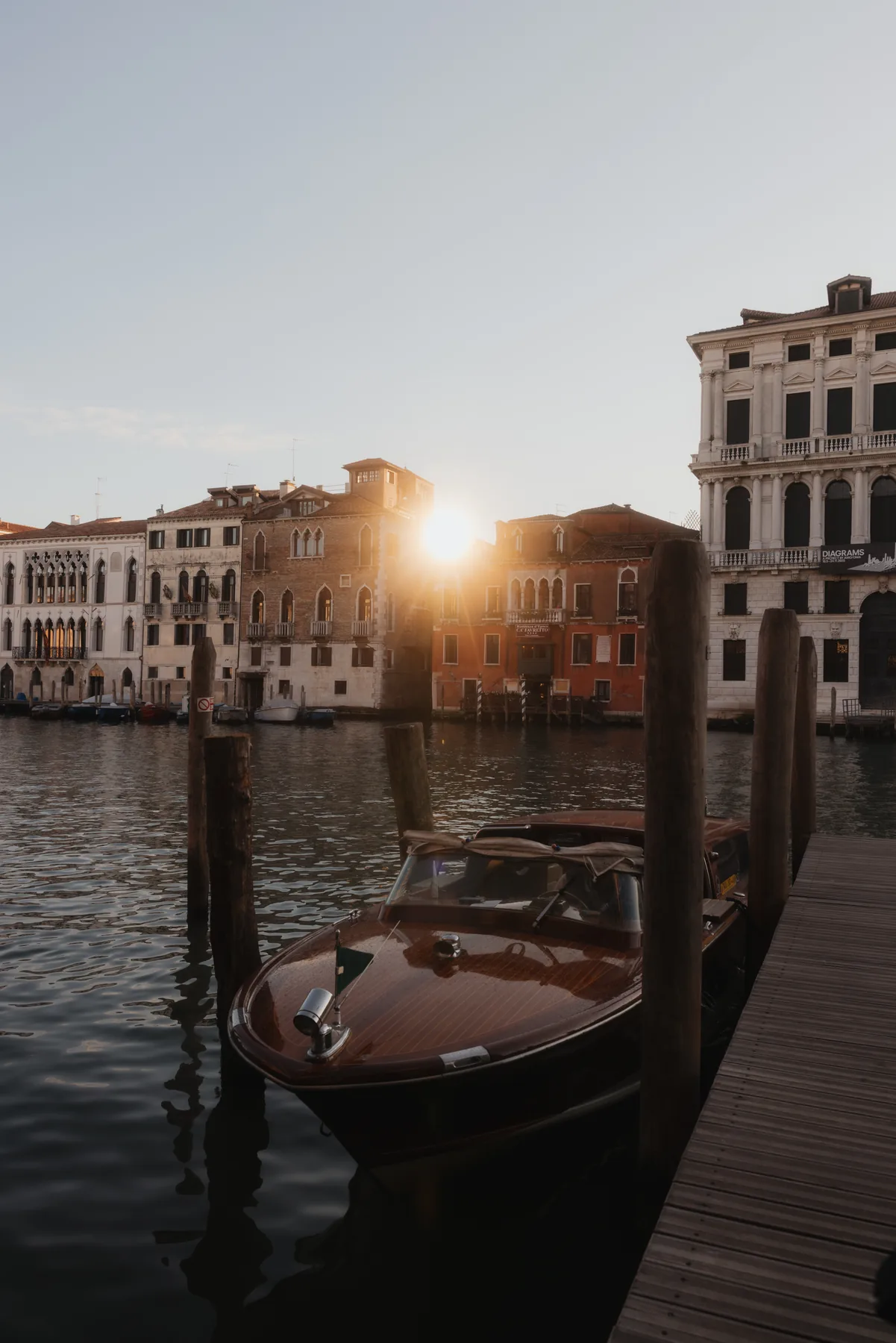
Designing within such a setting requires sensitivity. The intention should not be to recreate Venice through recognisable motifs, nor to introduce a concept that could exist anywhere else. It should begin with what is already present.
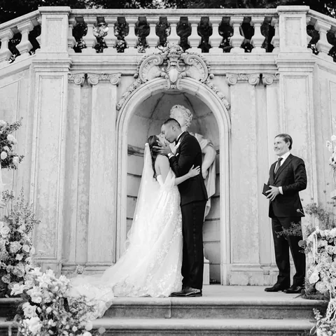
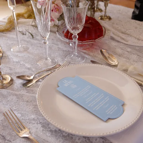
Conceived, planned and creatively directed by Marcia Fernandes & Co., Venetian Reverie was developed as a dialogue between past and present. Luminous whites, fluid fabrics and deep crimson created a contemporary visual narrative while allowing the historic character of Ca’ Sagredo to remain unmistakably visible.
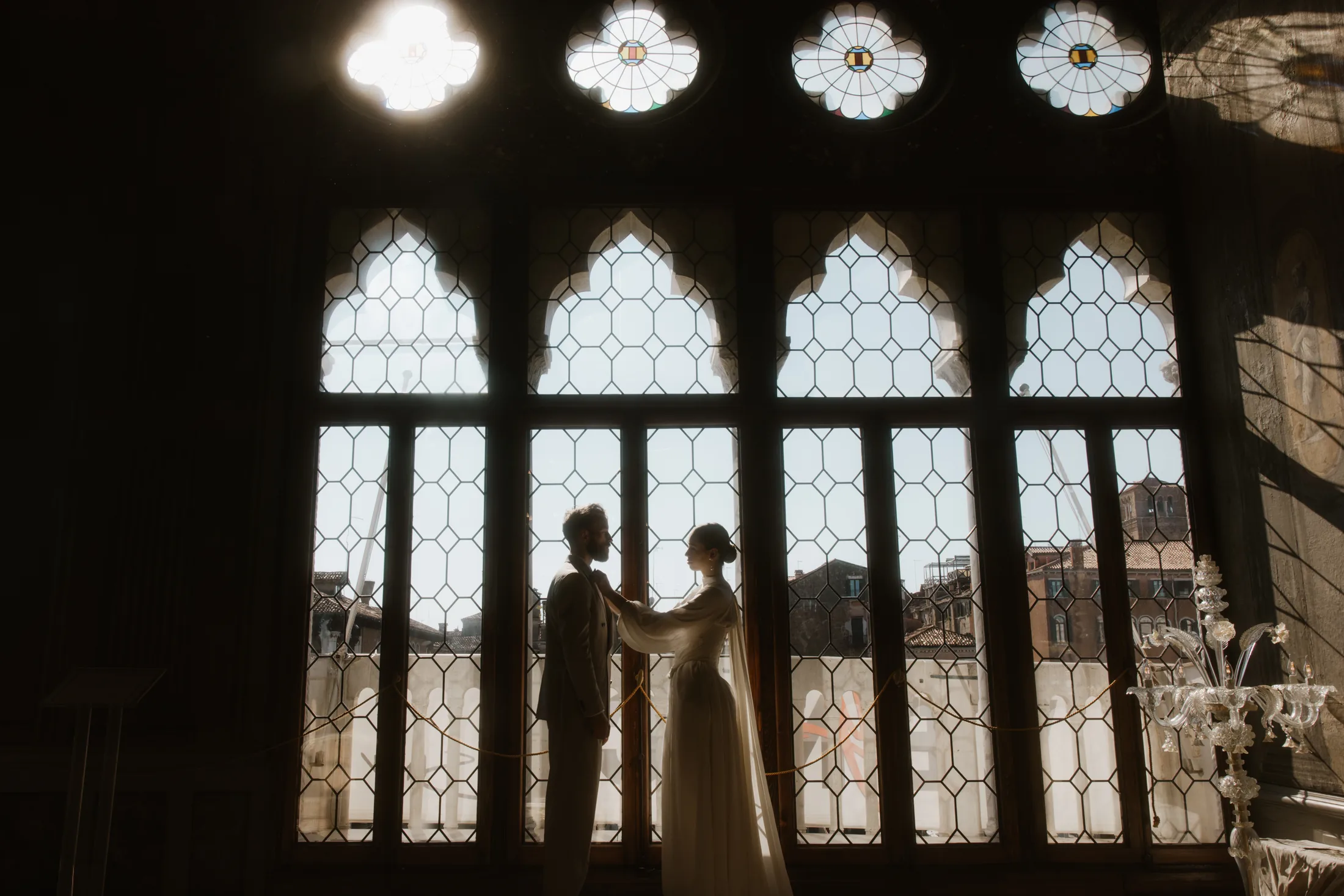
For couples drawn to places with a strong sense of identity, the setting becomes more than a backdrop. It becomes part of how the celebration is experienced and remembered.
Beginning with the Architecture
The architecture provided the foundation for every decision.
Painted ceilings, decorative surfaces, darkened doorways and grand proportions were not treated simply as a backdrop. They actively shaped the compositions, the movement and the placement of each element.
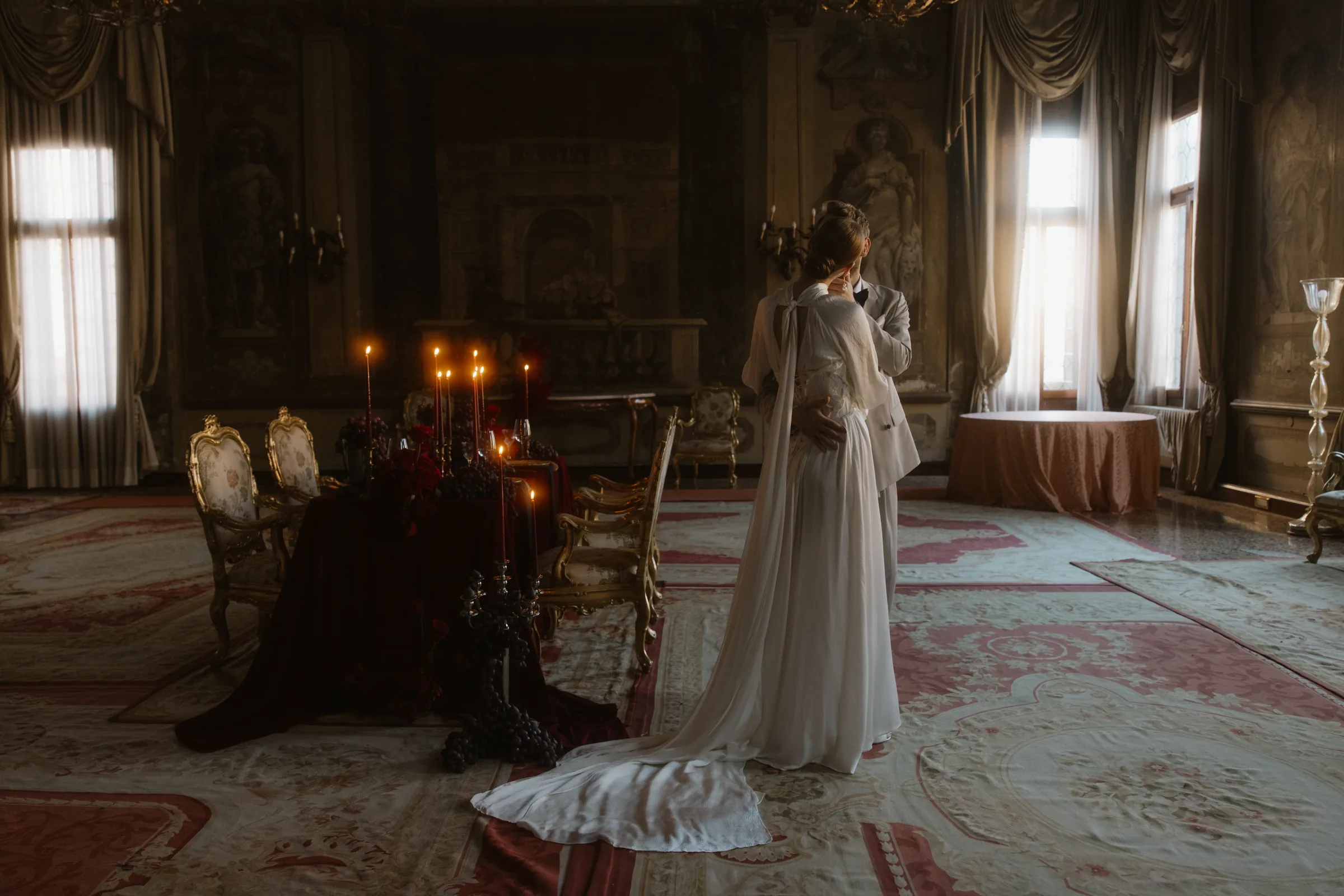
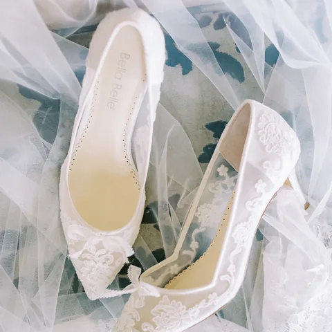
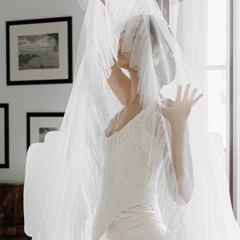
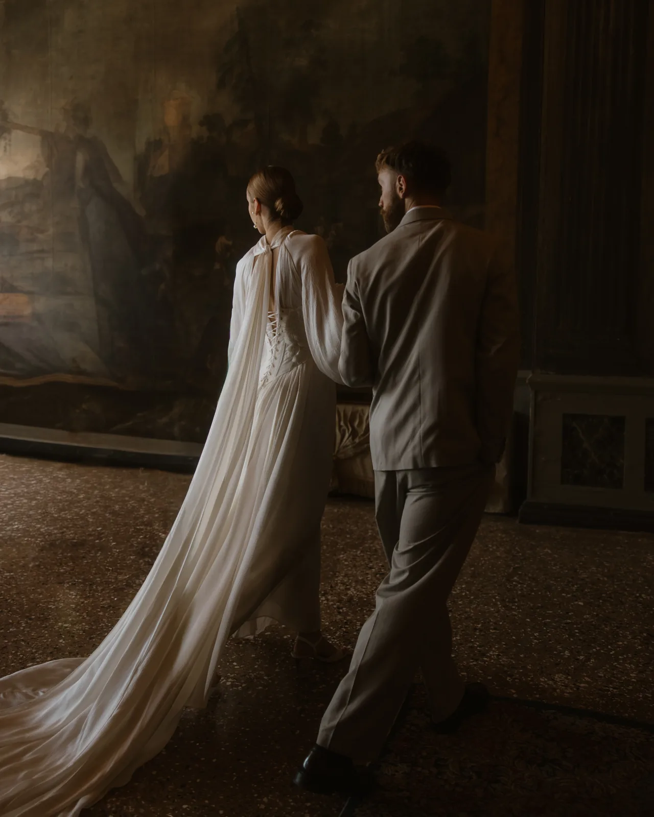
Rather than filling the rooms, the design responded to them. White fabric brought lightness to richly detailed interiors. Sculptural bridal silhouettes created contrast within the formal spaces, while bold areas of crimson created focal points without overwhelming the colours already present.
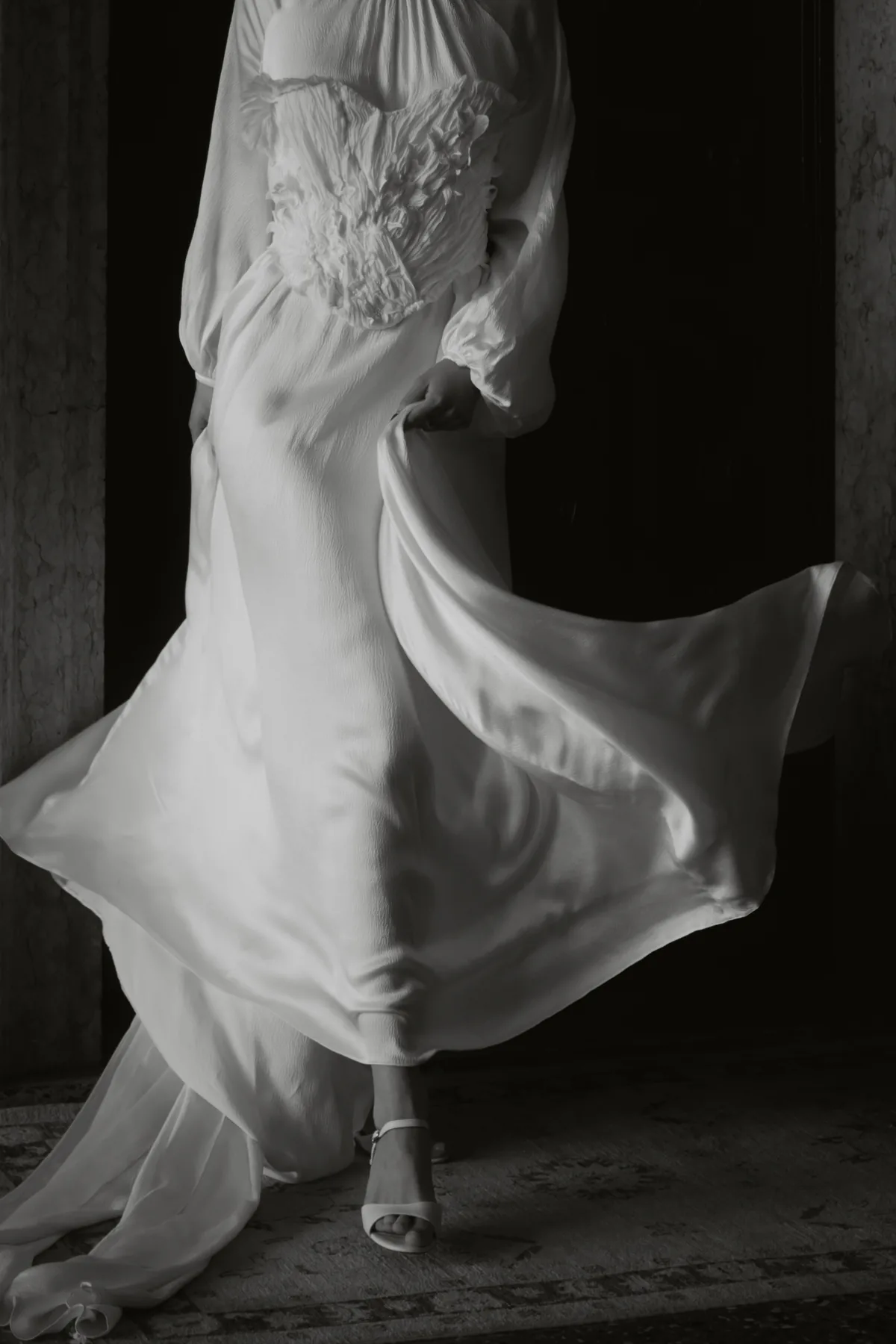
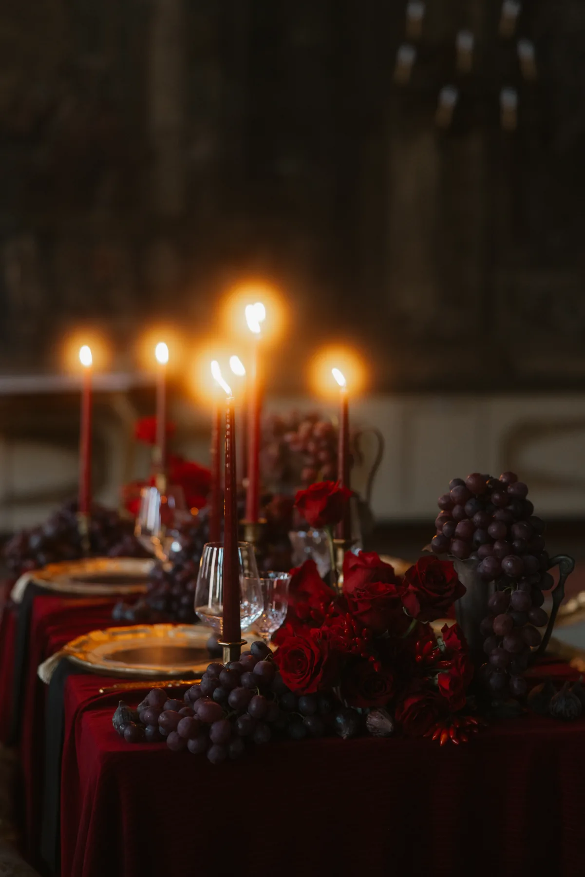
The result relied as much on what was left untouched as on what was added.
The setting participated in every composition.
Working with an Ornate Historic Venue
The more expressive the setting, the more important visual hierarchy becomes.
Restraint in this context does not necessarily mean minimalism. It means placing each element where it can have the greatest effect and leaving enough space around it to be fully appreciated.
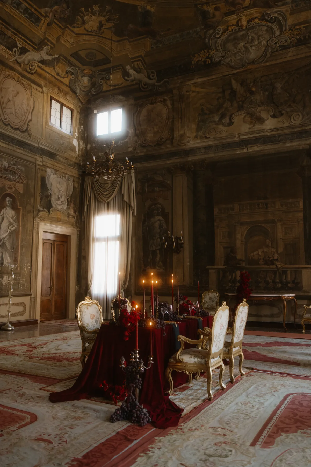
In a historic venue, decoration can quickly become visual competition. When architecture, artwork and furnishings already carry depth and ornamentation, every new detail needs a clear purpose. Scale, colour and placement must be considered not in isolation, but in relation to the room as a whole.
This is where thoughtful creative direction becomes essential: identifying which architectural features should remain dominant, where contrast will add meaning and where simplicity will create balance.
Translating Venetian Romance
Venetian romance is often interpreted through familiar symbols: masks, elaborate costumes, gilded details and theatrical references. For this editorial, the intention was not to reproduce those elements literally.
Instead, the story explored drama through light and shadow, and romance through movement.
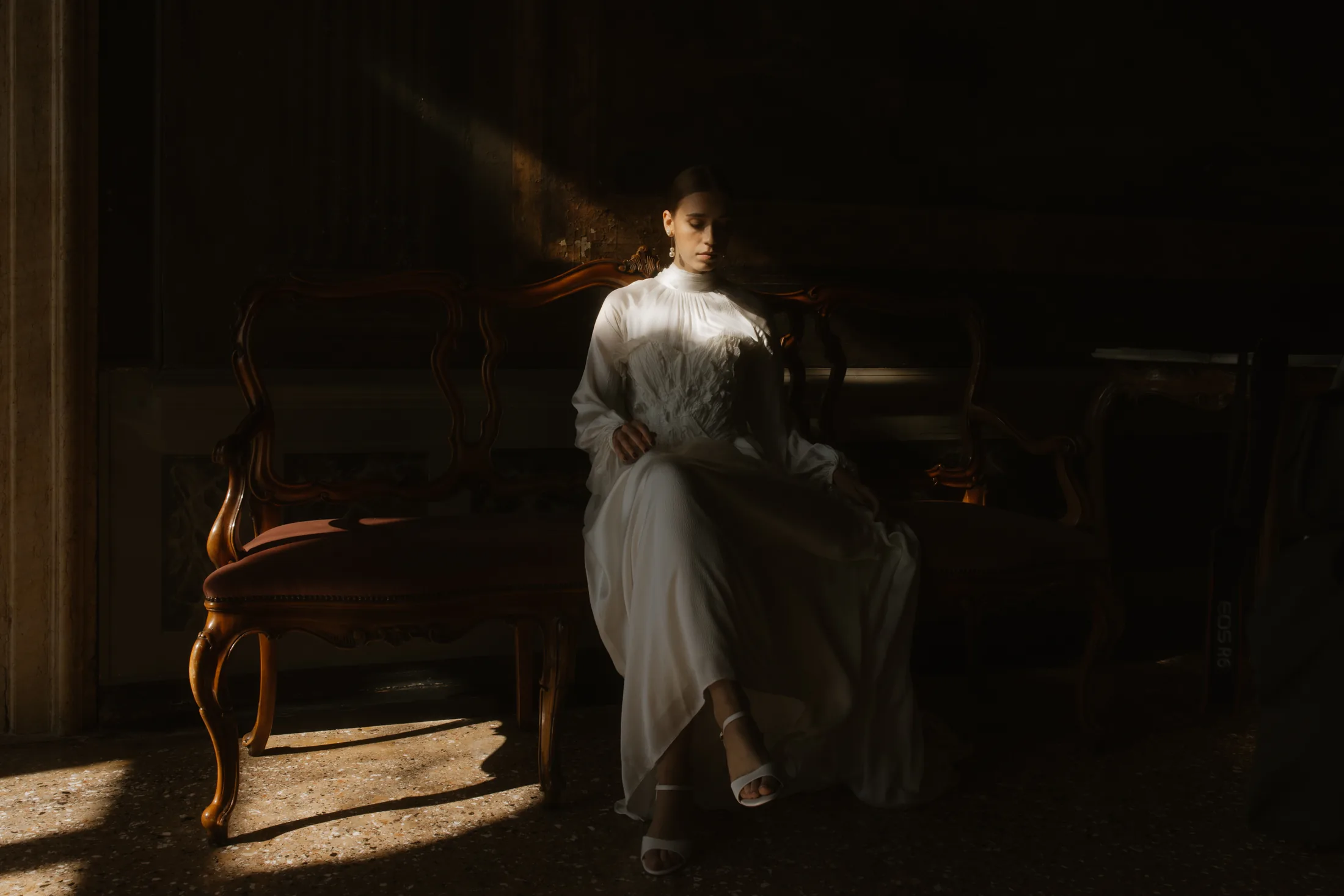
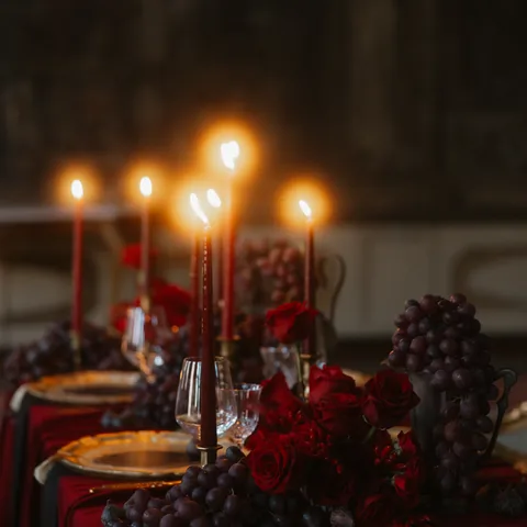
Fluid fabrics echoed the rhythm of the water outside. Contemporary bridal forms brought softness into monumental rooms. Deep crimson introduced intensity in carefully controlled moments, creating a connection to Venice’s theatrical character without turning the setting into a theme.
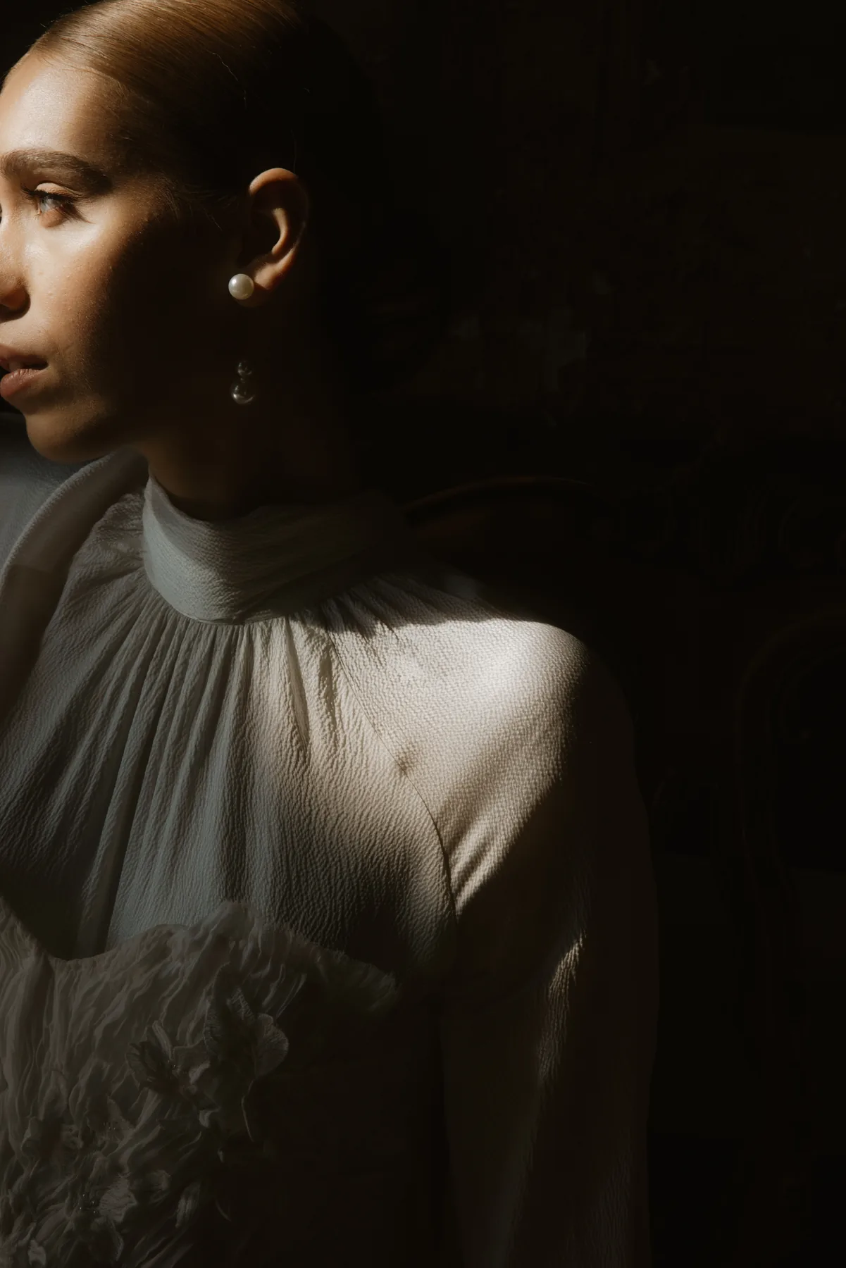
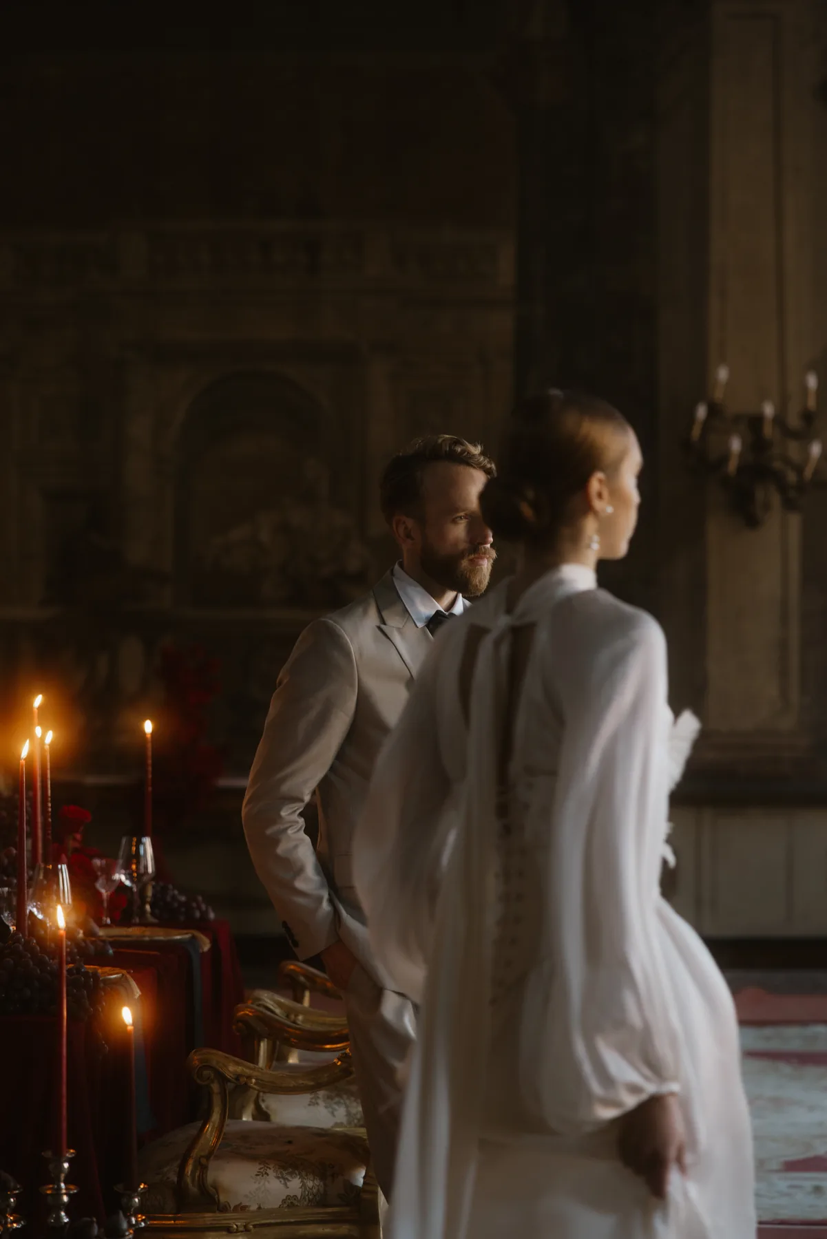
The editorial belongs to Venice without attempting to imitate it.
A sense of place does not need to be literal to feel unmistakable.
Creating Contrast with Intention
Contrast became the thread connecting the entire visual story: heritage and modernity, permanence and movement, restraint and theatricality.
Against the weight and permanence of the palazzo, fabric appeared almost weightless. Clean silhouettes stood apart from the intricacy of the frescoes. White brought clarity, while crimson created punctuation.
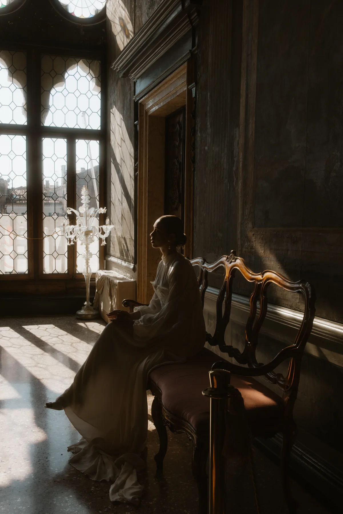
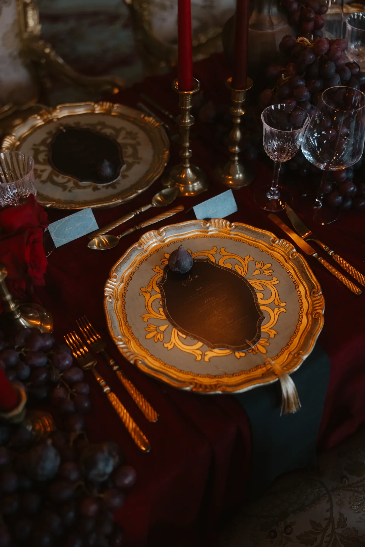
These contrasts were not introduced simply for visual impact. They allowed the contemporary elements and the historic setting to strengthen one another.
When contrast is intentional, neither the venue nor the design needs to become quieter. Each is given the space to retain its own identity.
Designing a Wedding That Belongs to Its Setting
For couples choosing a historic venue, the architecture is often part of the reason the place feels so meaningful. Its atmosphere, craftsmanship and sense of permanence create an experience that could not simply be reproduced elsewhere.
The design should begin with that connection.
Before defining colours, flowers or decorative details, it is important to understand the venue itself: its proportions, existing palette, natural light and most expressive features. From there, each decision can be considered in relation to the space and to the way the couple wants their celebration to feel.
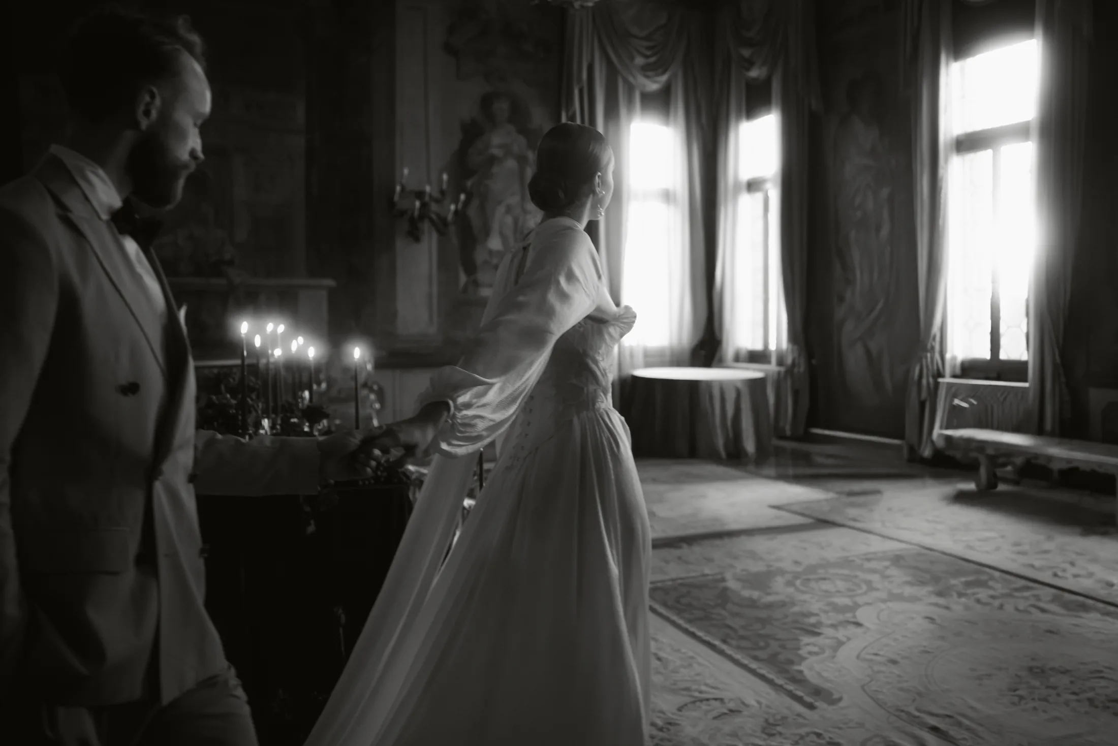
This does not mean allowing the venue to determine every creative choice. Personal expression remains essential. The role of thoughtful design is to find the point at which the identity of the couple and the character of the setting can meet naturally.
The objective is not to decorate every surface or conceal the history of the space. It is to create moments of emphasis, introduce contrast with intention and allow both the venue and the couple’s story to retain their presence.
A considered wedding design does not transform a historic place into something unrecognisable. It allows the celebration to feel personal while remaining connected to where it is taking place.
The most memorable celebrations feel personal to the couple and inseparable from their setting.
A Contemporary Story Within a Historic Palazzo
Venetian Reverie became a study in contrast: heritage and modernity, permanence and movement, restraint and theatricality.
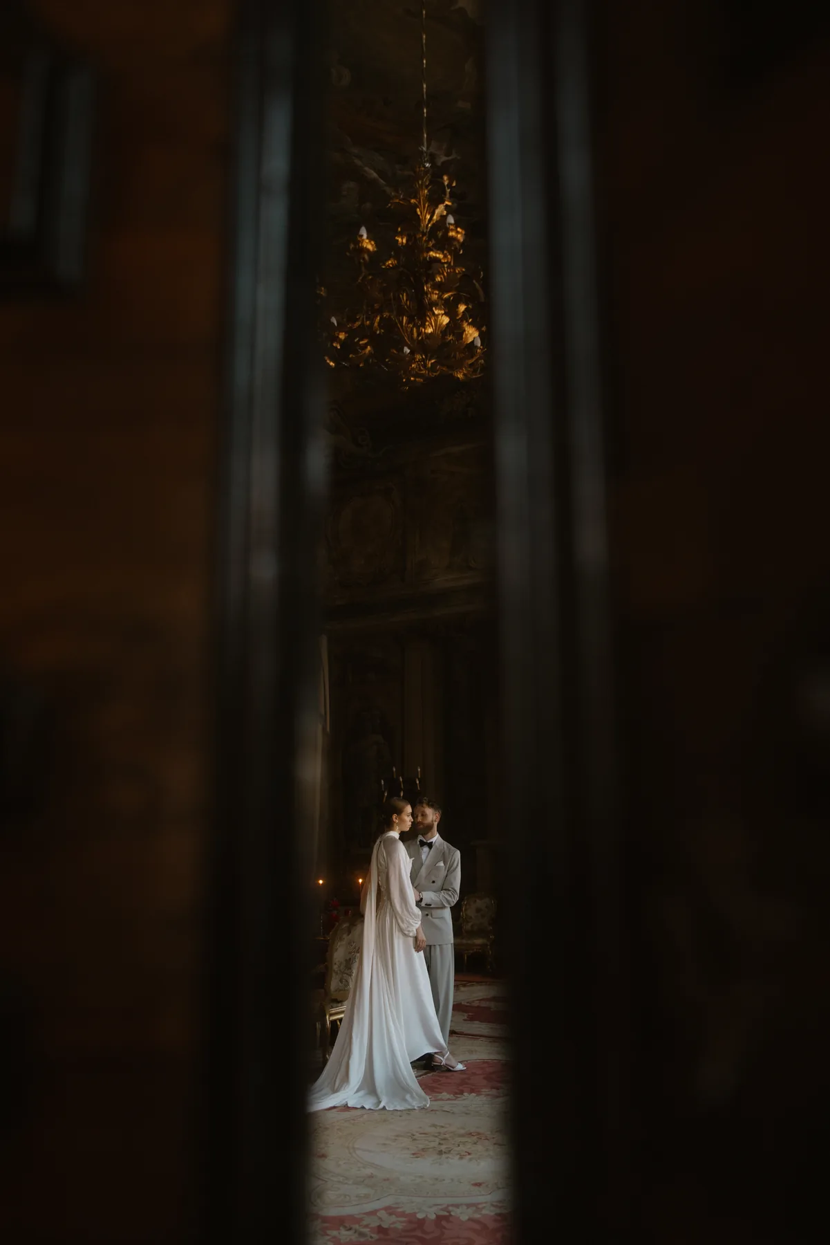
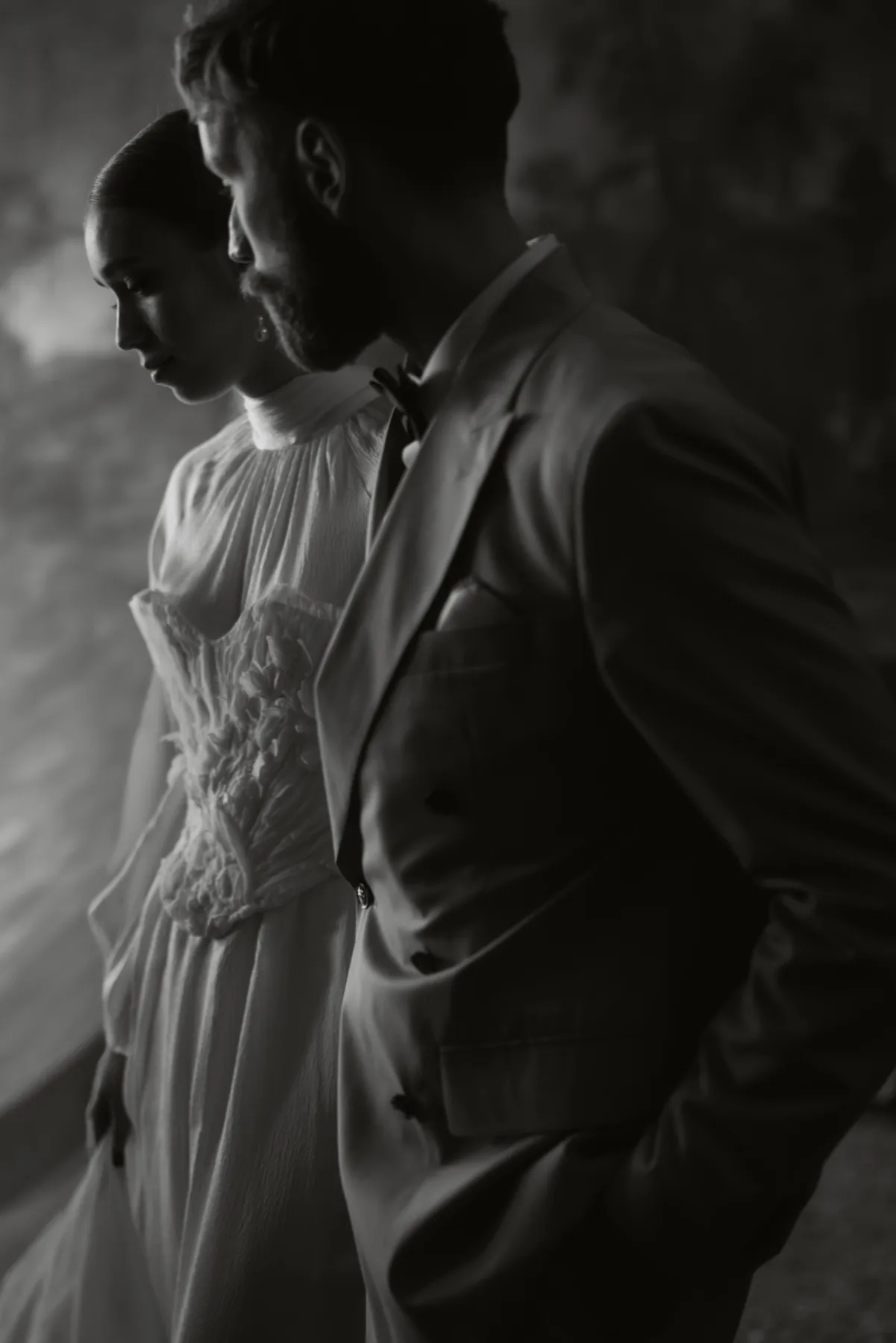
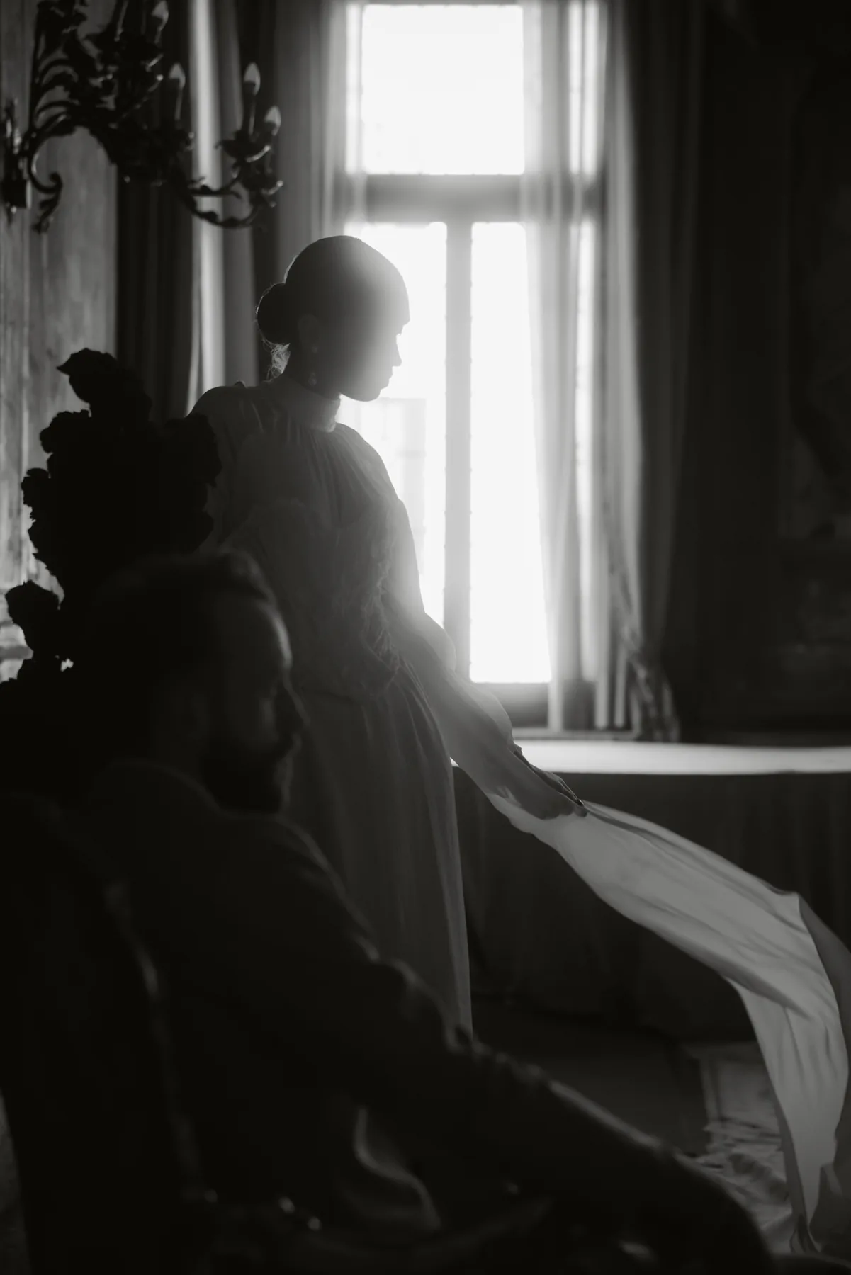
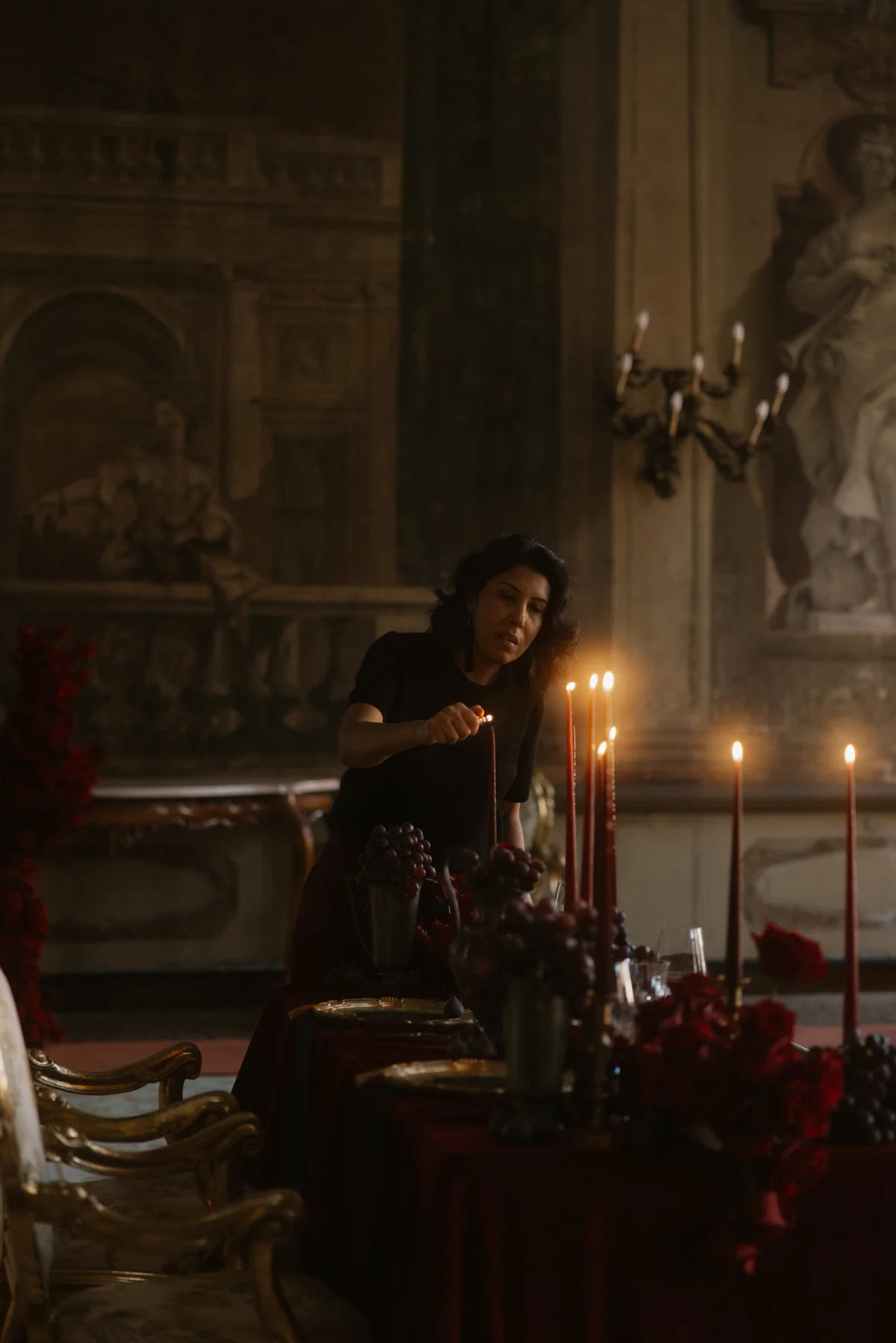
Although created as an editorial, its central principle extends naturally to the design of a wedding: a historic setting and a personal story do not need to compete for attention.
When the creative direction begins with a genuine understanding of both, the result can feel contemporary without disregarding history, and expressive without overwhelming the place.
For couples, this creates something more meaningful than a visually beautiful setting. It creates a celebration that feels considered, personal and entirely connected to where it unfolds.
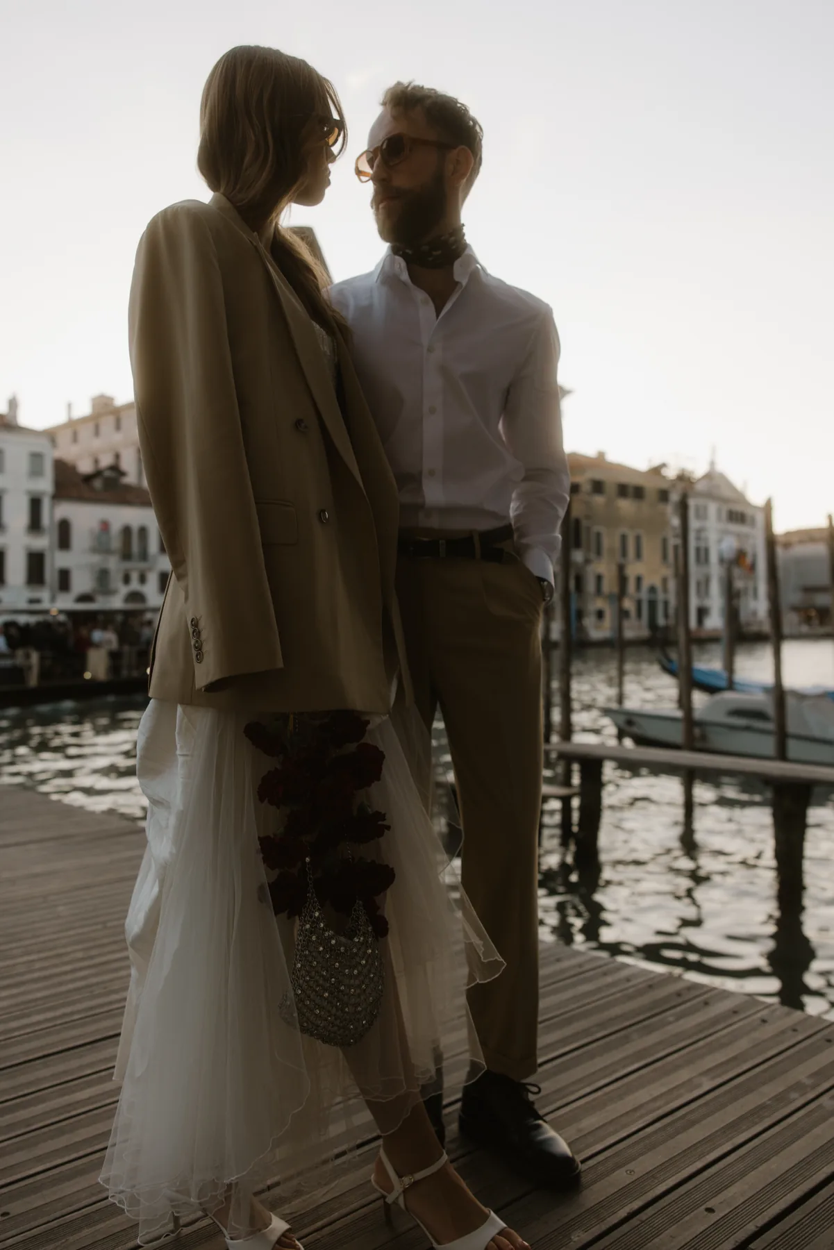
If you are planning a wedding in a place with history and a distinctive sense of character, I would love to create a design that feels personal to you and naturally connected to its setting.
Editorial Workshop: Glowsperience · Creative Direction, Planning & Wedding Design: Marcia Fernandes & Co. · Photography: Linda Mesa Weddings · Venue: Ca’ Sagredo Hotel · Fashion Stylist: Joana Serwus · Stationery: Invite Momentos Felizes · Floral Design: Fox Flora · Models: London Model Couple · Hair & Makeup: Blüesch · Dress Designer: Julita London · Tabletop Rentals: Rental Collection · Videography: Wild Silk Visuals